


4.9
'%3e%3cg%3e%3cpath%20d='M11.1034615625,1.816990478790283C11.4702615625,1.0737404787902831,12.5300515625,1.0737404787902831,12.8968515625,1.816990478790283L15.2941515625,6.674462478790283C15.4398515625,6.969602478790283,15.7214515625,7.174172478790283,16.047151562499998,7.221502478790283L21.4076515625,8.000432478790284C22.2278515625,8.119612478790284,22.5553515625,9.127592478790284,21.9618515625,9.706122478790283L18.0829515625,13.487052478790282C17.8472515625,13.716852478790283,17.7397515625,14.047852478790283,17.7953515625,14.372252478790283L18.7110515625,19.711052478790283C18.8511515625,20.527952478790283,17.9937515625,21.150952478790284,17.2601515625,20.765252478790284L12.4654515625,18.244552478790283C12.1741515625,18.091452478790284,11.8261515625,18.091452478790284,11.5348615625,18.244552478790283L6.7402115625,20.765252478790284C6.0065815625,21.150952478790284,5.1491515625,20.527952478790283,5.2892615625,19.711052478790283L6.2049515625,14.372252478790283C6.2605915625,14.047852478790283,6.1530415625,13.716852478790283,5.9173515625,13.487052478790282L2.0384295625,9.706122478790283C1.4449195625,9.127592478790284,1.7724199625,8.119612478790284,2.5926495625,8.000432478790284L7.9531815625,7.221502478790283C8.2788915625,7.174172478790283,8.560461562499999,6.969602478790283,8.7061215625,6.674462478790283L11.1034615625,1.816990478790283Z'%20fill='%23F0A000'%20fill-opacity='1'%20style='mix-blend-mode:passthrough'/%3e%3c/g%3e%3cg%20mask='url(%23master_svg1_5_13539)'%3e%3c/g%3e%3c/g%3e%3c/svg%3e)
Chrome Store
DreamFace
Language
EnBring your ideas into sharper focus with GPT Images 2.5 on DreamFace. Create from text or transform a reference photo with natural lighting, rich textures, and precise edits. Keep familiar subjects recognizable as you explore new settings, styles, and campaign ideas.
Upload JPG/PNG/WEBP images up to 10MB, with a minimum width/height of 300px.
Chrome Store
Global Users

Apple Store
Select GPT Images 2.5 in DreamFace. Start with a text prompt to create a new image, or upload a reference photo for an edit.
Specify the subject, setting, lighting, and style. For edits, explain what to change and which details to keep, such as the person's face or the product's shape.
Generate your image and check it against your brief. Adjust your prompt for another variation, or download the result when you are happy with it.













GPT Images 2.5 From a Creator's Perspective
The Background Changed. My Product Still Looked Right.
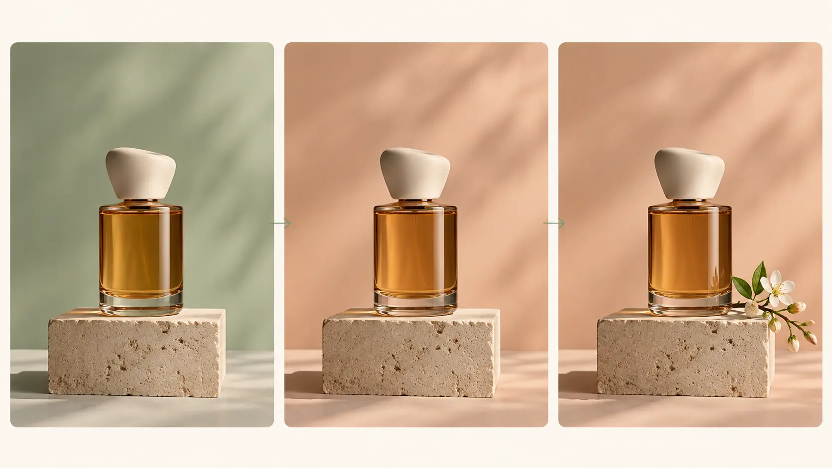
I had a photo of a handmade candle that needed a warmer setting for our autumn collection. I asked for a wooden shelf and soft evening light. The result kept the jar recognizable and gave me a direction I actually wanted to use. I still checked the label closely, but it was a useful starting point.A Portrait That Still Felt Like Me
I wanted a more editorial look for my profile photo, but I didn't want to end up with a different face. I tried a darker background and softer lighting. What I liked was that the picture felt more considered without losing the expression that made me choose the original.Small Revisions Were Easier to Manage
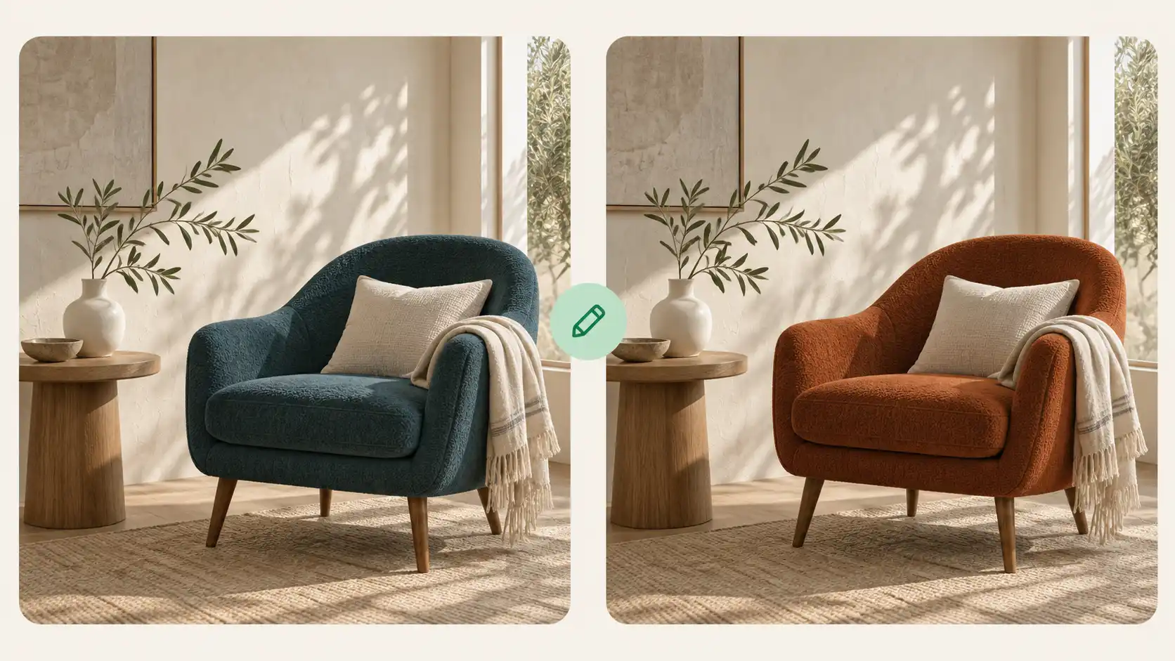
My first poster concept was close, so I used it as the reference for another edit. I changed the wall color, then tried a different prop. I liked being able to work through those decisions separately. One version needed another adjustment, but I had a clear direction to keep building on.The Little Details Made the Scene
I tried a breakfast scene for a food post: linen, a bowl of peaches, and light coming through a window. The texture in the cloth and the shadows around the bowl were what caught my eye. I ended up choosing the quieter version because it suited the post better.It Helped Me Explain the Look I Wanted
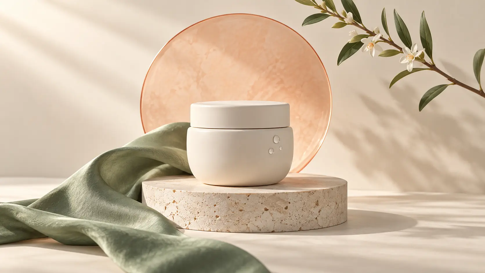
For a launch concept, I described a muted palette, a single product, and plenty of room above it for copy. The layout gave our team something concrete to discuss. We still made changes, but it was much easier to talk about a picture than keep trading descriptions in a message thread.A Fun New Look for My Dog's Photo
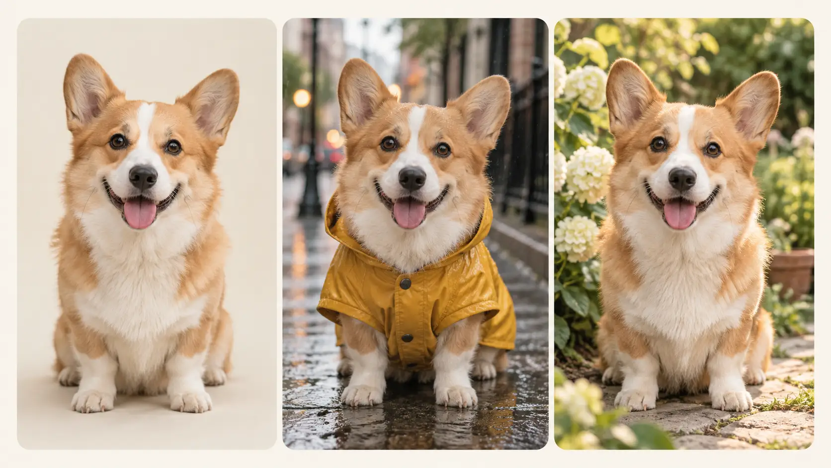
I used a photo of my dog and asked for a tiny raincoat and a rainy street. The first coat was a little too bright, so I tried a softer color. His expression was the part I wanted to keep, and that was what made the finished picture fun for me.The Background Changed. My Product Still Looked Right.
I had a photo of a handmade candle that needed a warmer setting for our autumn collection. I asked for a wooden shelf and soft evening light. The result kept the jar recognizable and gave me a direction I actually wanted to use. I still checked the label closely, but it was a useful starting point.A Portrait That Still Felt Like Me
I wanted a more editorial look for my profile photo, but I didn't want to end up with a different face. I tried a darker background and softer lighting. What I liked was that the picture felt more considered without losing the expression that made me choose the original.Small Revisions Were Easier to Manage
My first poster concept was close, so I used it as the reference for another edit. I changed the wall color, then tried a different prop. I liked being able to work through those decisions separately. One version needed another adjustment, but I had a clear direction to keep building on.The Little Details Made the Scene
I tried a breakfast scene for a food post: linen, a bowl of peaches, and light coming through a window. The texture in the cloth and the shadows around the bowl were what caught my eye. I ended up choosing the quieter version because it suited the post better.It Helped Me Explain the Look I Wanted
For a launch concept, I described a muted palette, a single product, and plenty of room above it for copy. The layout gave our team something concrete to discuss. We still made changes, but it was much easier to talk about a picture than keep trading descriptions in a message thread.A Fun New Look for My Dog's Photo
I used a photo of my dog and asked for a tiny raincoat and a rainy street. The first coat was a little too bright, so I tried a softer color. His expression was the part I wanted to keep, and that was what made the finished picture fun for me.