


GPT Image 2.5 Prompting Guide: 4 Real Examples for Creators
A campaign image can look beautiful and still miss the brief. The headline might compete with a face, a product diagram might become unreadable on mobile, or an outfit edit might change more than the clothes.
- Text-to-Image
- AI Image Generator
- GPT Image 2.5
A campaign image can look beautiful and still miss the brief. The headline might compete with a face, a product diagram might become unreadable on mobile, or an outfit edit might change more than the clothes.
For creators, those details decide whether an image is ready to use.
This guide examines four examples published in OpenAI’s GPT Image 2.5 prompting guide, then turns them into practical creative exercises. The comparison images use OpenAI’s actual examples, arranged for this article. They are not DreamFace-generated outputs or a performance benchmark.
Flare or Sunburst: Where Should You Start?
OpenAI positions GPT Image 2.5 Flare for speed and GPT Image 2.5 Sunburst for demanding quality needs. Both support generation and editing. Compare them on your own brief; individual showcase images cannot establish a universal winner. See the official model guidance.
For a useful creative review, define acceptance criteria before generating. A social ad needs readable copy at its final display size. A fashion edit needs a recognizable subject and believable garment fit. A tutorial graphic needs correct information.
The following examples show why those criteria differ.
1. Campaign Images: Make the Message Part of the Composition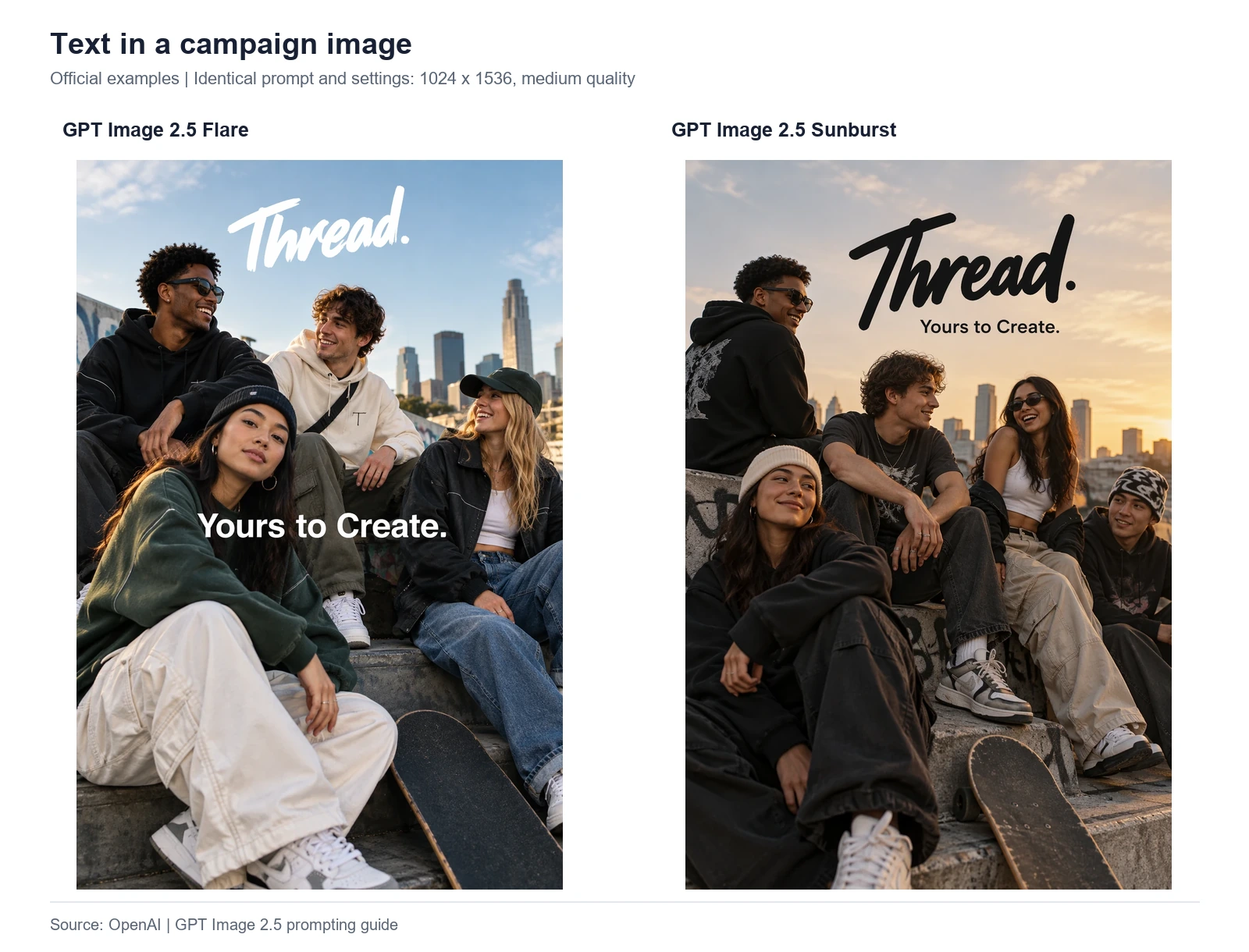
Official OpenAI outputs. Flare appears on the left; Sunburst appears on the right. View the source example.
In these images, the same campaign message occupies different visual roles. Flare places the tagline across the people in the foreground. Sunburst groups it near the brand name in the sky above the group. Both arrangements create a different reading order: your eye encounters the words and the people in a different sequence.
For a marketer, the question is which arrangement supports the placement. A feed preview, a landing-page banner, and a poster do not necessarily need the same hierarchy.
Try this original practice prompt:
Design a portrait campaign image for a fictional weekend ceramics workshop. Show two adult friends shaping clay at a bright studio table. Place the headline “Make Something Together” in the clear wall space above them, separate from faces and hands. Use warm cream and terracotta colors. Include no additional copy.
Review before publishing: Shrink the image to its intended mobile display size. Can someone read the headline without zooming? Check punctuation, accidental lettering, and whether the platform’s crop removes any essential words.
2. Information Graphics: Judge the Reading Path
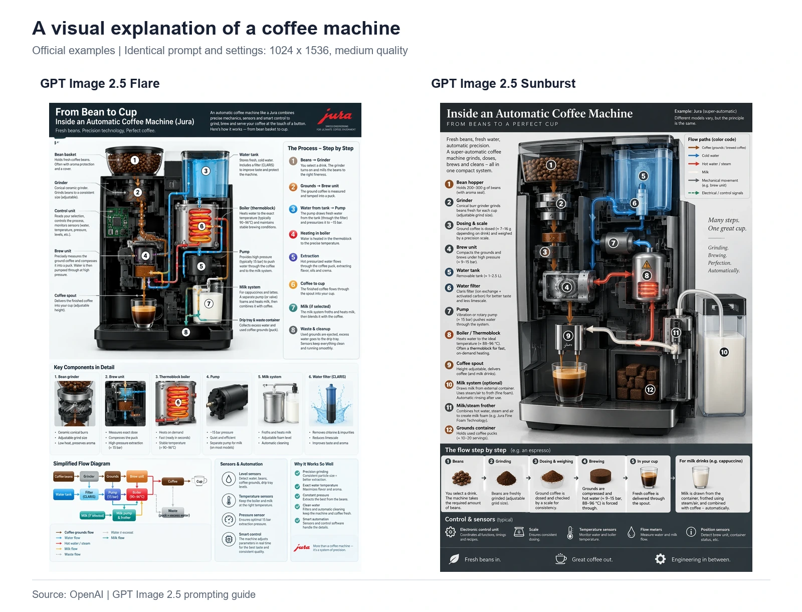
Official OpenAI coffee-machine examples, combined without cropping their content. View the source example.
The left example uses a large machine illustration, component cards, and a compact flow diagram below. The right organizes much of its explanation around a central cutaway, with additional process information across the lower section.
These are visually different answers to the same communication problem. Their layouts offer a useful review exercise: where should a beginner look first, and where should their eye go next?
A dense infographic may work as a downloadable reference but struggle inside a narrow blog column. Decide whether readers need a quick overview or a detailed document before choosing the amount of information.
Try this original practice prompt:
Create a beginner-friendly landscape graphic explaining a three-step photo workflow: upload a portrait, choose a visual direction, and review the result. Use exactly three large numbered cards, connected from left to right. Each card should have one simple illustration and one short label. Keep the background white and the layout readable on a phone.
Review before publishing: Read every label and trace every arrow. For technical subjects, have someone with relevant expertise verify the explanation. Attractive organization alone does not establish factual accuracy.
3. Clothing Edits: Compare Against the Original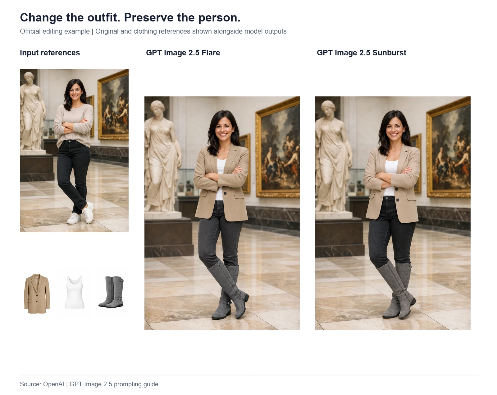
The original person and garment references appear on the left, followed by the official Flare and Sunburst edits. View the source example.
This comparison is more informative with the input images included. You can inspect the requested garments alongside the outputs, then compare the person and the museum setting with the original photograph.
Look closely at the crossed arms, the jacket opening, and the meeting point between the trousers and boots. These are places where a garment must interact convincingly with an existing pose. A pleasing silhouette is only one part of the result.
For portrait-led content, keep an approved original available throughout review. Comparing two new outputs with each other is insufficient when both might have moved away from the reference.
Try this original practice prompt with your own reference photo:
Replace the subject’s jacket with the supplied navy cardigan. Retain the original face, hairstyle, expression, posture, trousers, and setting. Fit the sleeves around the existing arm position. Keep the reference photo’s lighting and framing.
Review before publishing: Compare the face, hands, body proportions, and background against the original at full size. If the result will introduce a real person, ask whether they would recognize and approve the representation.
4. Follow-Up Edits: Build Seasonal Variations
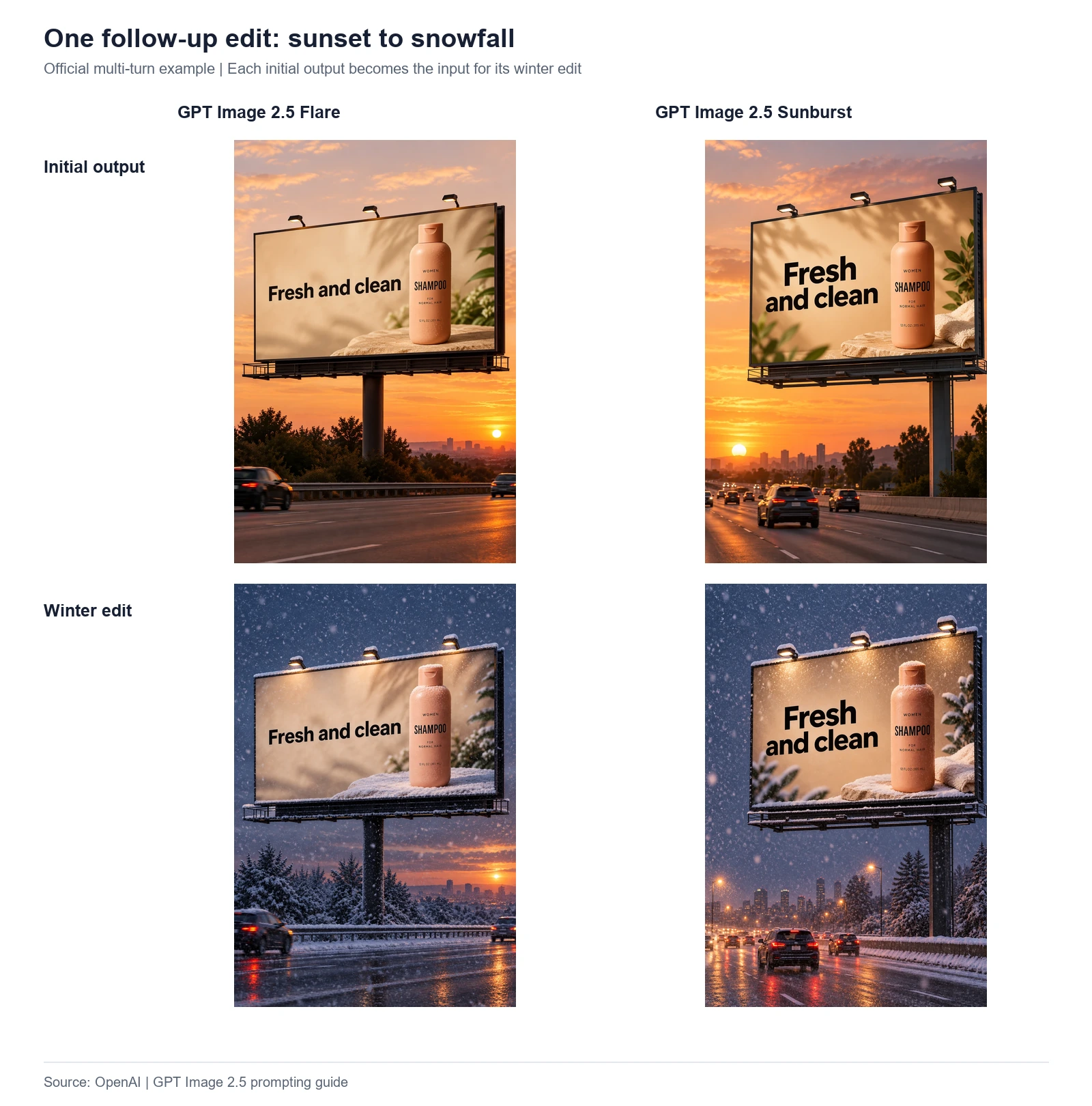
Columns identify the models; rows show the initial billboard and its winter edit. View the source sequence.
The four-image layout lets you follow each model vertically. The warm sunset scene becomes a snowy evening while the billboard remains the focal point. Comparing diagonally would mix a model change with an editing step, making the result harder to interpret.
This is a useful way to present seasonal campaign work to a team. Keep each approved concept paired with its variation, so reviewers can identify which details were retained and which changed.
Try this original practice prompt with an approved campaign image:
Create an autumn version of this café campaign. Add a small arrangement of amber leaves beside the cup and make the outdoor foliage golden. Retain the cup, printed wording, table arrangement, and camera position.
Review before publishing: Check small lettering, object edges, reflections, and background details. Keep an earlier approved file so that an attractive seasonal effect does not replace a more accurate version unnoticed.
Put the Lessons to Work in DreamFace
Choose a real deliverable: a creator portrait, a campaign still, or a character image. Write a brief that explains what a successful result must communicate, then use those criteria to review your first draft.
You can explore image creation through DreamFace’s AI Image tools . If your next deliverable needs motion, explore DreamFace’s AI Video tools and plan a short scene around the selected image.
Before moving from a still image to a video, decide what should move. A subtle camera move, a changing background, and a speaking character are different creative directions. Give the video its own brief and inspect the resulting clip.
The examples above belong to OpenAI’s documentation. They do not establish which models are available in DreamFace; consult the current tool interface for available options.
Frequently Asked Questions
Is Sunburst always the better choice?
A single example cannot answer that for your project. Compare outputs using a defined brief and your own quality requirements, including the time needed for review and corrections.
Can I reuse the practice prompts?
Yes. The practice prompts in this article are original examples written for readers to adapt. Replace the subject, setting, and creative requirements with your own. They are separate from the official prompts that produced the comparison images.
Are the comparison images DreamFace results?
No. They are official OpenAI example images, combined into labeled comparison layouts. Their purpose is to make the examples easier to inspect.
What should I check before turning an image into a video?
Review the subject’s appearance, composition, text, and intended crop first. Then define the motion or action separately. A strong still gives you a useful starting point, but the video needs its own quality review.
Ready to work on your next visual? Start creating with DreamFace.
Best GPT Image 2 Prompt Examples: 8 Creative Ideas for Photos, Posters, UI, and Storytelling
Explore 8 GPT Image 2 prompt examples for photos, posters, UI mockups, characters, storytelling, and image editing, with tips to adapt each idea.
By Gabriel一Apr 27, 2026- Text-to-Image
- ChatGPT
ChatGPT Image 2 Review: Real Tests Reveal What Actually Changed
If you’ve used AI image generators before, you already know the frustration. Hands often look unnatural, text turns into gibberish, and prompts keep getting longer while results remain inconsistent. For a long time, AI image generation felt less like using a tool and more like playing a lottery.
By Zoe一Apr 23, 2026- GPT Image 2
- AI Image Generator
- GPT-4o Image
GPT Image 2 Is Here — And It’s Redefining What “Real” Means on the Internet
The arrival of GPT Image 2 didn’t just improve AI image generation — it completely disrupted it. In fact, many users are already saying it outright: GPT Image 2 crushes Nano Banana 2. And they’re not exaggerating.
By Adeline一Apr 21, 2026- GPT-4o Image
- AI Image Generator
- GPT Image 2